
Projects
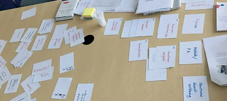
Guidance for the Marketing Department of a Sea Port company in transition >>
Zeeland Seaports (now North Sea Port) was in a turbulent phase of its existence. It needed to operate more commercially, and a merger was in the works.
"How can we, as a communications department, be prepared for the upcoming situation and support the organization by developing a leading direction, ensuring that we can quickly develop a smart new website in any scenario?"

Brand and Product Illustration for a Software Company >>
Software for Chemistry & Materials (SCM) was using many different images of chemical models interchangeably, creating a cluttered impression.
We developed a powerful vector illustration of an Au atom with a nanotube that scales seamlessly across all media, from website to a 4x3 metre trade show banner in the USA.
The result: a cohesive, spatial image that became the cornerstone of SCM's corporate identity.

Design of logo and trade show display for a Software company >>
Object+, a software company for pre- and post-trade clearing solutions, needed a major visual upgrade to make a strong impression at FIA exchanges in the UK and US.
We developed a new logo reflecting the software's flexibility, extended it into a full corporate identity, and created a striking backlit trade show display with a distinctive Dutch Rembrandt touch, that turned heads at the booth in Chicago.
Articles

Pure craftsmanship and high quality are great, but your competitors are cheaper >>
"I still hear the operations manager saying: 'For years, we’ve been producing at high quality and have been extremely busy. So everything is going great!'" Wilco tells me. "And a week later, I hear that production has halted for half a day because there are no orders."
"Then the operations manager asks me if there are any orders sitting on the shelf," says Wilco, with a look of disbelief. "This is exactly what the operations managers are missing: thinking ahead and acting to make sure there’s no sand in the gears."
It melts in the mouth >>
MasterChef cooks develop into fascinating characters.
Your products should too. Give them depth that touches customers emotionally and strengthens your market position.