More projects
Read more projects >>
The cases are still only available at the old website. Most projects and cases are written in Dutch only for now. We are currently converting and translating everything to the new format.
Zeeland Seaports (now North Sea Port) was in a turbulent phase of its existence. It needed to operate more commercially, and a merger was in the works.
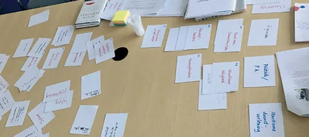
"How can we, as a communications department, be prepared for the upcoming situation and support the organization by developing a leading direction, ensuring that we can quickly develop a smart new website in any scenario?"

Software for Chemistry & Materials (SCM) was using many different images of chemical models interchangeably, creating a cluttered impression.
We developed a powerful vector illustration of an Au atom with a nanotube that scales seamlessly across all media, from website to a 4x3 metre trade show banner in the USA.
The result: a cohesive, spatial image that became the cornerstone of SCM's corporate identity.

Object+, a software company for pre- and post-trade clearing solutions, needed a major visual upgrade to make a strong impression at FIA exchanges in the UK and US.
We developed a new logo reflecting the software's flexibility, extended it into a full corporate identity, and created a striking backlit trade show display with a distinctive Dutch Rembrandt touch, that turned heads at the booth in Chicago.
The cases are still only available at the old website. Most projects and cases are written in Dutch only for now. We are currently converting and translating everything to the new format.